
Ironworks is a construcution company that wanted its brand image to be able to communicate its values of providing superior quality and reliability to the target audience, and setting itself apart in the saturated market simultaneously. The logo for ironworks may look simple, but there is thorough research and design thinking behind it. The logo is made to look like constrcution framework, and the specific shade of red was chosen to create a reference to the red iron material used in construction. Red iron is harder than standard steel, has a longer life, and also has a higher resistance to rust. The logo succeeds in communicating the message that Ironworks does not slack when it comes to quality. Moreover, the logo is unique in this industry and quite easy to remember, while sticking to the look that would be considered appropriate for a business that mainly sells to other businesses.
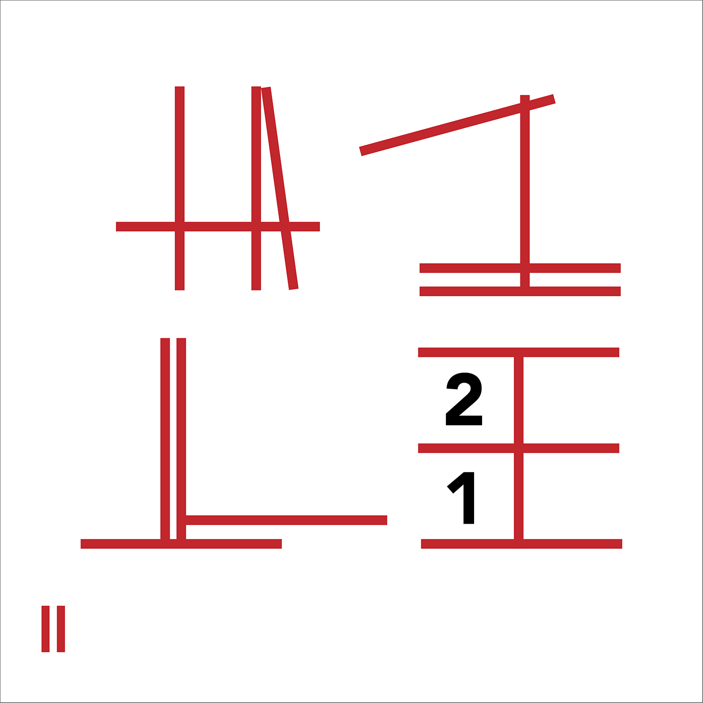
The red lines of the logo have be used as graphic elements to create a complete visual identity of the company
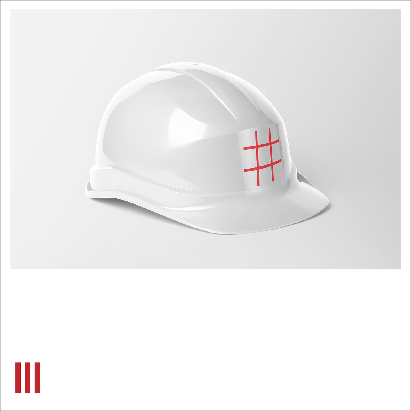
The logo on the standard white safety helmets the company uses

The website needed to be congruent to the company’s core brand identity. Here, the red lines have been used yet again as graphic elements subtly throughout the design. The font chosen for the brand (and the website) was ‘Avenir’. The company wanted to appear as professional and modern with leaning more towards appearing professional. This was the deciding factor which made Avenir the better option over Helvetica or Futura. The ‘framework’ structure which the brand identity is built on was further reinforced by the specific image chosen


